நிறங்கள் வார்த்தைகளை விட மிகவும் அதிகமாக பேசுகின்றன

உங்கள் இடத்திற்கான டைல் நிறங்களை தேர்வு செய்வது ஒரு வேடிக்கையான பணியாக இருக்கலாம். இல்லையா? வெறுமனே, நீங்கள் விரும்பும் ஒரு வண்ண பாலெட்டை தேர்ந்தெடுப்பது சிறந்தது. நிச்சயமாக, நிற திட்டம் இடத்திற்காக வேலை செய்ய வேண்டும் மற்றும் உங்கள் வடிவமைப்பு ஸ்டைலுடன் பொருந்த வேண்டும், ஆனால் நீங்கள் அதை கண்டறிந்தவுடன், மீண்டும் பார்க்க முடியாது..
ஆனால் எந்த நிறம் எந்த இடத்திற்காக வேலை செய்கிறது என்பதை நீங்கள் எவ்வாறு கண்டறிவீர்கள்?
நிறங்கள் உங்கள் மனநல ஆரோக்கியத்தை மிகவும் பாதிக்கின்றன மற்றும் நீங்கள் எவ்வாறு சிந்திக்கிறீர்கள், பேசுகிறீர்கள், உணர்வு மற்றும் சட்டத்தை பாதிக்கலாம் - இது உங்கள் இடத்திற்கு சரியான டைல் நிறத்தை தேர்வு செய்வதை மிகவும் முக்கியமாக்குகிறது! நல்லது, நிறங்களின் உளவியல் எங்கே வருகிறது என்பது இங்கே. நிற உளவியல் என்பது ஒரு இடத்தில் பயன்படுத்துவதற்கான நிறத்தை தீர்மானிக்க உட்புற வடிவமைப்பாளர்களால் பயன்படுத்தப்படும் ஒரு கருவியாகும், குறிப்பிட்ட நிறம் உருவாகும் உணர்வுகளின் அடிப்படையில்..
மேலும் படிக்க: நிறத்தின் உளவியல்: உங்கள் வீட்டிற்கான சிறந்த நிற திட்டத்தை எவ்வாறு தேர்ந்தெடுப்பது
தி கலர் வீல்
நிற சக்கரத்தை நாங்கள் புரிந்துகொள்வதற்கு முன்னர், முதலில் "நிறம்" என்றால் என்ன என்பதை புரிந்துகொள்வோம். அறிவியல் விதிமுறைகளில் பேசுவதன் மூலம், ஒரு பொருளின் மேற்பரப்பை பிரதிபலிக்கும் பல்வேறு அலைநீளங்களுக்கு எங்கள் மூளை மற்றும் கண்களின் பதில் மட்டும் நிறம் ஒன்றுமில்லை..

நிற சக்கரத்தில் முதன்மை நிறங்கள் உள்ளன - சிவப்பு, மஞ்சள் மற்றும் நீலம், இரண்டாம் நிறங்களை இணைப்பதன் மூலம் செய்யப்படும் முதன்மை நிறங்கள் - ஊதா, ஆரஞ்சு மற்றும் பச்சை மற்றும் டெர்ஷியரி நிறங்கள்..
நிறங்களை இரண்டு செட்களாகவும் பிரிக்கலாம் – வெதுப்பான நிறங்கள் மற்றும் குளிர்ச்சியான நிறங்கள்.
- வெதுவெதுப்பான நிறங்கள் சிவப்பு, ஆரஞ்சு மற்றும் மஞ்சள் நிறங்களைக் கொண்டுள்ளன. இந்த நிறங்கள் சூரிய அல்லது தீ போன்ற அனைத்து விஷயங்களையும் எங்களுக்கு நினைவூட்டுகின்றன மற்றும் ஒரு வெதுவெதுப்பான உணர்வை வழங்குகின்றன..
- குளிர்ச்சியான நிறங்கள் நீலம், ஊதா மற்றும் பச்சை நிறங்களைக் கொண்டுள்ளன. இந்த நிறங்கள் தண்ணீர் மற்றும் புல் போன்ற குளிர்ச்சியான விஷயங்களை நினைவூட்டுகின்றன மற்றும் எங்களில் ஒரு குளிர்ச்சியான உணர்வை உருவாக்குகின்றன..
டைல் கலர் சைக்காலஜி
சிவப்பு டைல்ஸ் உடன் பேஷனை பயன்படுத்துங்கள்

சிவப்பு நிற டைல்ஸ் உங்கள் உணவகத்திற்கு ஒரு முனையை வழங்கலாம்.
One of the boldest colours on the colour wheel, a lot of people tend to shy away from this colour since it makes a striking statement. The colour red can heighten the senses and invoke a feeling of passion, love, romance, and determination. It is a colour that can make a long-lasting first impression and can start conversations..
Red tiles can add a touch of drama to any space when used in large quantities. A large mural or a striking accent wall works well in spaces such as malls or living rooms. If you are not one for theatrics, you can opt to use red tiles to add warm accents in an otherwise cool space. Adding red tiles to spaces like kitchens, dining rooms, and food establishments, such as restaurants, bars, and cafes, works well since red is known to increase appetite..
நிச்சயமாக, நீங்கள் தேர்வு செய்யும் சிவப்பு நிறம் பெரிய வேறுபாட்டையும் உருவாக்குகிறது:
- லைட் ரெட்: மகிழ்ச்சி, பாலியல், ஆர்வம், உணர்திறன் மற்றும் காதல்
- அஞ்சல்: காதல், நட்பு மற்றும் நட்பு
- இருண்ட சிவப்பு: ஆக்ஷன், விகோர், தைரியம், தலைமை மற்றும் நம்பிக்கை

பிங்க் மற்றும் ஒயிட் டைல்ஸ் ஒருபோதும் தவறாக இருக்க முடியாது.
உங்கள் இடத்திற்கான சரியான டைலை தேர்ந்தெடுப்பதற்கு முன்னர் எங்கள் டைல் வாங்குதல் வழிகாட்டி-ஐ நீங்கள் சரிபார்க்கலாம்..
ஆரஞ்சு டைல்ஸ் உடன் ஒரு போரிங் இடத்தை வசிக்கவும்

Orange has the ability to uplift the mood of a space and enliven even the blandest of spaces. Orange reminds us of good things like sunshine and joy and tropical smoothies! It is the perfect marriage between the excitement that red brings with the warm welcome of yellows..
ஆரஞ்சு என்பது ஒரு நிறமாகும், இது ஒரு பெரிய விரிவாக்கத்தை உள்ளடக்க பயன்படுத்தக்கூடாது, ஏனெனில் இது இடத்தை மிகவும் அதிகரிக்கும்..
Instead, orange can be used as an accent to inject little pops of colours or in smaller areas, like the backsplash. Similar to red, orange also helps stimulate the appetite, making it an excellent choice for kitchens, dining rooms, and eating establishments. Since orange also helps induce a feeling of determination, it is also ideal for spaces where a high amount of energy is required – such as gyms or exercise rooms. Muted shades such as டெரக்கோட்டா ஆரஞ்சு அல்லது ஹனி பீச் can help invoke relaxing vibes and is an ideal choice for bedrooms...
இது மஞ்சள் மற்றும் சிவப்பு ஆகியவற்றின் சரியான போட்டியாகும், நிழலைப் பொறுத்து பல்வேறு விளைவுகளுடன்:
- பிரகாசமான ஆரஞ்சு: வெதுவெதுப்பு, உற்சாகம் மற்றும் உற்சாகம்
- சிவப்பு-ஆரஞ்சு: விளையாட்டு, ஆற்றல் மற்றும் ஈடுபாடு
- தங்கம்: பிரெஸ்டீஜ், விஸ்டம், இல்யூமினேஷன் மற்றும் செல்வம்
மஞ்சள் டைல்ஸ் உடன் மகிழ்ச்சியை சேர்க்கவும்

Yellow is a very multi-faceted colour. It promotes feelings of happiness, energy, intellect, and joy. It is also said that yellow helps spark creativity and encourages communication. But, it is very important to choose the right shade of yellow – go too bright and it can feel very overwhelming, opt for a shade that is too dull and you will feel like the space is just devoid of energy..
Yellow tiles make for an ideal choice for spaces such as kitchens, bathrooms, and dining rooms. Since yellow also helps create an illusion of brightness and light, it is also a great choice for windowless rooms and hallways. The different shades of yellow can be used in different ways to elevate the aesthetic of your space. When combined with grey, deep yellow tiles give the space a chic modern look. On the other hand, a buttery yellow can invoke the feeling of homeliness and warmth..

உங்கள் கண்களுக்கு பச்சை டைல்ஸ் கொடுங்கள்

பச்சை என்பது இயற்கையின் நிறமாகும் – இலைகள், புல், மற்றும் அழகின் நிறம். இது கண்களில் மிகவும் ஆராமமான விளைவைக் கொண்டுள்ளது..
Green symbolizes renewal, denoting growth, fertility,, and freshness. It also evokes a sense of emotional safety, calmness,, and security in space..
நீங்கள் நினைக்கக்கூடிய எந்தவொரு இடத்திலும் கிரீன் டைல்ஸை பயன்படுத்தலாம். ஒரு மோனோக்ரோமேட்டிக் தோற்றத்திற்கு ஒரே இடத்தில் பல்வேறு நிறங்களை நீங்கள் பயன்படுத்தலாம். இயற்கைக்கு நெருக்கமான ஒரு இடத்தை உருவாக்க வுட் டோன்கள் (மற்றும் வுட் ஃப்ளோர் டைல்ஸ்) உடன் இணைக்கப்படலாம். மேலும் நவீன தோற்றத்திற்கு கிரே ஃபர்னிச்சர் உடன் கிரீன் டைல்ஸ் இணைக்கப்படலாம். கடல் பச்சை டைல்ஸ் திறந்த மற்றும் காற்று உணர்வை வழங்க பயன்படுத்தலாம். ஆழமான பச்சை டைல்ஸ் அல்லது டீக் கிரீன் டைல்ஸ் இடத்தை ஒரு புரிந்துகொள்ளப்பட்ட ஆனால் நேர்த்தியான தோற்றத்தை வழங்க முடியும்..

ப்ளூ டைல்ஸ் உடன் இன்ஃப்யூஸ் டிரான்குயிலிட்டி

Blue is the colour of the ocean and of the sky. It represents so many feelings and emotions based on the different shades. It can evoke a sense of tranquillity and calmness, but also strength and determination. It is said that looking at the colour blue can help slow down the heart rate and reduce blood pressure..
குழந்தை நீலம் அல்லது ஸ்கை ப்ளூ போன்ற லைட் ப்ளூ டைல்ஸ், படுக்கை அறைகள், குளியலறைகள் மற்றும் சமையலறைகள் போன்ற தளர்வான வைப்களை நீங்கள் இன்ஃப்யூஸ் செய்ய விரும்பும் எந்தவொரு இடத்திற்கும் ஒரு சிறந்த கூடுதலாகும்..

Sapphire blue tiles are a great way to add energy to a space and can be used in studies or conference rooms to stimulate the mind. If you wish to add a touch of drama, but in a subtle way, you can opt for navy blue tiles to the backsplash or use them for accent walls. Midnight blue tiles, especially with shades of purple, can evoke a sense of luxury in any space..
பர்பிள் டைல்ஸ் உடன் லக்சரியின் ஒரு டச்சை சேர்க்கவும்
The colour purple is often associated with royalty, giving off luxurious vibes. Since the colour is a combination of bright red and calming blue, it can either be vibrant or subtle, depending upon the shade. Darker shades of the colour often have an eccentric, exotic feel, while lighter shades have a soothing effect..
Purple tiles can add another layer of depth to a space and brighten up a darker colour scheme. Dark purple tiles, especially ஃப்ளோர், can give your space a mysterious feel, and silver accents can be used to emphasize the colour. Pastel purple is very much vogue and can provide the space a soft yet modern look
வெள்ளை டைல்ஸ் உடன் புதிதாக சிந்தியுங்கள்

White evokes a feeling of purity and often denotes a clean slate – a new start. It is also very soothing and often used to signify innocence..
வெள்ளை நிறம் உணர்ச்சிகரமான அழுத்தத்தை அதிகரிக்க உதவுகிறது மற்றும் திறமையான மற்றும் கட்டுப்பாட்டில் உங்களுக்கு உதவுகிறது. வெள்ளை டைல்ஸ் பெரும்பாலும் சுத்தத்தையும் புத்துணர்ச்சியையும் பயன்படுத்துகிறது, மேலும் அவற்றின் எளிமை உங்களை அமைதியாக உணர்கிறது..

வெள்ளை டைல்ஸ் உண்மையில் அதை விட எந்தவொரு அறை அல்லது இடத்தையும் அதிகமாக தோன்றலாம். ஆனால், அக்சன்ட் பீஸ்கள் அல்லது பிற நிறங்களுடன் வெள்ளை சமநிலைப்படுத்தப்படவில்லை என்றால் அது ஸ்டெரைல் தோற்றத்தில் இருந்து வெளியேறலாம். நாங்கள் வெள்ளையை ஒற்றை நிறமாக சிந்திக்கும் போது, அண்டர்டோன்களைப் பொறுத்து வெள்ளையில் பல்வேறு நிறங்கள் உள்ளன. ப்ளூ அண்டர்டோன்களுடன் வெள்ளை இடத்தில் ஒரு வேகமான தாக்கத்தை ஏற்படுத்தலாம், அதே நேரத்தில் மஞ்சள் அண்டர்டோன்களுடன் வெள்ளை மென்மையான மற்றும் ரிலேக்ஸிங் வைப்பை வழங்கலாம். வெள்ளை ஜோடிகள் சாத்தியமான அனைத்து நிறங்களுடனும் நன்றாக இருக்கும், ஆனால் கருப்பு மற்றும் வெள்ளையின் கலவை ஒரு டைம்லெஸ் கிளாசிக் ஆகும்..
சரியான வெள்ளை டைலை தேர்ந்தெடுப்பதற்கு முன்னர், இதை சரிபார்க்கவும் உங்கள் வீட்டிற்கு ஒரு நேரமில்லாத தோற்றத்தை வழங்குவதற்கு 6 கருப்பு மற்றும் வெள்ளை டைல் டிசைன்கள்
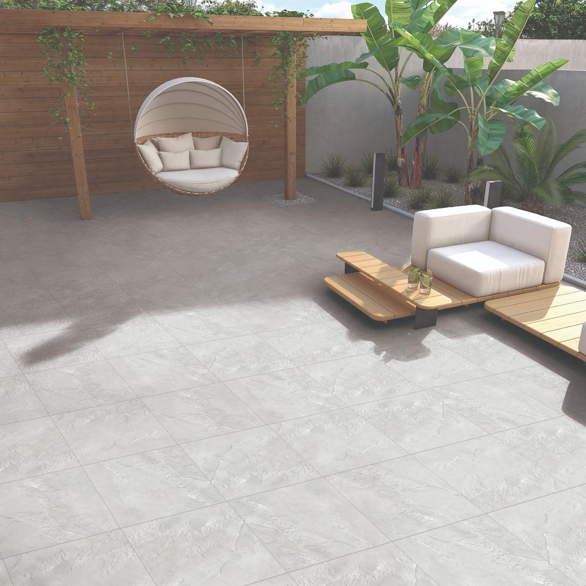
கிரே டைல்ஸ் உடன் இன்ஃப்யூஸ் அதிநவீனம்

Grey is a powerful colour that oozes calmness, serenity, elegance,and opulence. This is a timeless colour that can be traditional and modern, depending on how you use it..
தற்போது, கிரே டைல் குளியலறைகள் வீட்டு உரிமையாளர்களிடையே ஒரு சிறந்த வலிமையாகும். சிறிய டோஸ்களில் பயன்படுத்தும்போது கிரே டைல்ஸ் அற்புதமானதாக இருக்கிறது. சில பிரகாசமான நிறங்களை சமநிலைப்படுத்த அவற்றை ஒரு மாறுபட்ட கூறுகளாகவும் பயன்படுத்தலாம் மற்றும் அவற்றை நிலைநிறுத்த உதவுகிறது..

மேலும், உங்கள் இடத்திற்கு சிக் லுக் கொடுக்க கிரே டைல் யோசனைகளை தவறவிடாதீர்கள்
நிறத்தில் அனுபவியுங்கள்
உங்கள் ஆளுமையுடன் பிரதிபலிக்கும் மற்றும் உங்கள் இடத்திற்கான மனநிலையை உருவாக்க உதவும் ஒரு நிறத்தை (அல்லது ஒரு நிற பாலெட்) கண்டுபிடிப்பது மிகவும் முக்கியமானது. உங்கள் பெட்ரூமில் பிரகாசமான சிவப்பு டைல்களை சேர்க்க நீங்கள் விரும்பவில்லை, ஏனெனில் அது உங்களை மேம்படுத்தி ஓய்வு பெறுவதை கடினமாக்கும். அதேபோல் பேபி ப்ளூ போன்ற உடற்பயிற்சி நிறங்களில் நிறங்களை சேர்க்க நீங்கள் விரும்பவில்லை. நீங்கள் எந்த டைல் நிறத்தை தேர்வு செய்கிறீர்களோ, அது உங்களை சிறப்பாக உணர்கிறது என்பதை உறுதிசெய்யவும்!