06 டிசம்பர் 2022 | புதுப்பிக்கப்பட்ட தேதி: 19 செப்டம்பர் 2025, படிக்கும் நேரம்: 5 நிமிடம்
822
ஒரு நிற கதை: பிரவுன் டைல் வாங்குதல் கையேடு
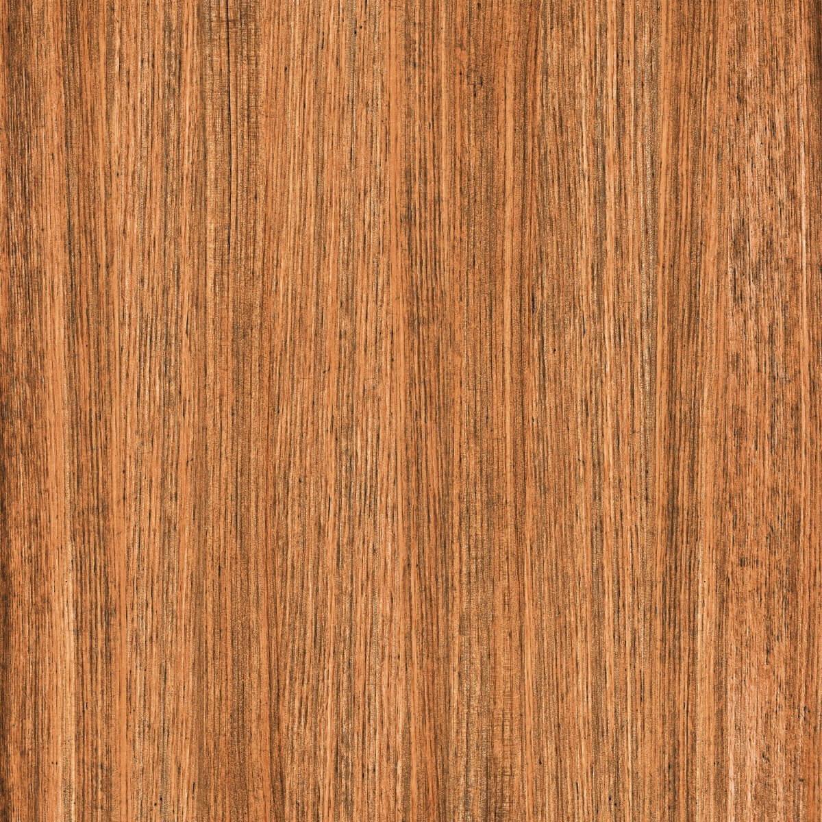
வண்ண பிரவுன் பெரும்பாலும் மரத்துடன் தொடர்புடையது மற்றும் பெரும்பாலும் இயற்கையைப் போன்ற உணர்வை உருவாக்குகிறது. நிறம் பெரும்பாலும் நிலைத்தன்மை, நம்பகத்தன்மை, பாதுகாப்பு மற்றும் பாதுகாப்பை குறிக்கிறது மற்றும் ஒருவரை தளர்த்துகிறது. எந்தவொரு இடத்தையும் அழைத்தல் மற்றும் அது இடத்தை வழங்கும் பூமிக்கு நன்றி தெரிவிக்கும் திறனைக் கொண்டுள்ளது - தளர்வை ஊக்குவித்தல்..
Brown tiles are often used on floors to add some earthiness to the space, but more and more homeowners and designers are adding brown tiles to their walls to create that warm and inviting ambience, especially in spaces like living rooms, reception areas and lobbies..
இருப்பினும், இடத்தை மிகவும் இருண்ட அல்லது ஃப்ளாட் ஆக இல்லாமல் இடங்களில் பயன்படுத்த பிரவுன் ஒரு சிக்கலான நிறமாக இருக்கலாம். இதனால்தான், பிரவுன் டைல்ஸ் வாங்குவதற்கான உங்கள் பயணத்தை தொடங்குவதற்கு முன்னர், பிரவுன் மற்ற நிறங்களுடன் எவ்வாறு வேலை செய்கிறது மற்றும் மற்ற நிறங்களுடன் பிரவுன் எவ்வாறு ஜோடி செய்வது என்பதை நீங்கள் புரிந்துகொள்ள வேண்டும்..
பிரவுன் டைல்ஸ் என்ன நிறங்களுடன் சிறப்பாக வேலை செய்கிறது?
பிரவுன் டைல்ஸ் often tend to have a very traditional look, but the final look will depend upon the colours or shades you pair your brown tiles with as well as on the design elements, such as furniture and décor pieces in your space...
உங்கள் இடத்திற்கு பயன்படுத்த பிரவுன் நிறத்தின் தேர்வு நீங்கள் உருவாக்க விரும்பும் சூழலைப் பொறுத்தது. நீங்கள் ஒரு பிரகாசமான மற்றும் திறந்த தோற்றத்தை விரும்பினால், பிரவுன் டைல்ஸின் லைட்டர் நிறங்களை தேர்வு செய்யவும். நீங்கள் ஒரு வெதுவெதுப்பான மற்றும் அழகியலை அழைக்கிறீர்கள் என்றால், டார்க்கர் பிரவுன் டைல்ஸ்-ஐ தேர்வு செய்யவும். டார்க் பிரவுன் டைல்ஸ் இடத்தில் சில டிராமாவை சேர்க்கலாம் மற்றும் அதற்கு ஒரு சிறந்த தோற்றத்தை வழங்கலாம்..
பிரவுன் டைல்ஸ் உடன் மிகவும் பொதுவான நிறங்களை பார்ப்போம். பொதுவாக பேசுவது, பிரவுன் என்பது ஸ்பெக்ட்ரம் மீது கிட்டத்தட்ட எந்தவொரு நிறத்துடனும் நன்கு வேலை செய்யும் ஒரு நிறமாகும், நீங்கள் பிரவுனின் சரியான நிறத்தை தேர்வு செய்தால். ஒரு முட்டாள் விதியாக, ஒருங்கிணைந்த தோற்றத்தை உருவாக்க வெதுவெதுப்பான பிரவுன்களுடன் கூல் பிரவுன்கள் மற்றும் வெதுவெதுப்பான நிறங்களுடன் ஜோடி கூலர் நிறங்கள்..
1) லைட் மற்றும் டார்க் நிறங்களின் கலவையைப் பயன்படுத்துதல்
பிரவுன் டைல்ஸை பயன்படுத்துவதற்கான ஒரு சிறந்த வழி என்னவென்றால் பல தோற்றத்திற்கு இருண்ட மற்றும் லைட் நிறங்களின் கலவையை பயன்படுத்துவது. இருண்ட மற்றும் லைட் நிறங்களின் கலவையைப் பயன்படுத்தி இடத்திற்கு சில விஷுவல் ஆழத்தை சேர்க்க உதவுகிறது மற்றும் அதை சரிவில் இருந்து வைத்திருக்கிறது. பல வடிவங்களின் பயன்பாடு பிரவுனின் ஏககத்தை உடைக்கவும் மற்றும் இடத்திற்கு காட்சி வட்டியை சேர்க்கவும் உதவும்..
2) பிரகாசமான நிறங்களுடன் இணைந்து
நீங்கள் பிரகாசமான நிறங்களை விரும்பினால் ஆனால் அவற்றை சமநிலைப்படுத்த விரும்பினால், பிரவுன் டைல்ஸ் உங்களுக்கு சிறந்தது. பிரவுன் டைல்ஸ் பயன்படுத்தப்பட்ட இரண்டு நிறங்களின் நிறத்தைப் பொறுத்து லைம் கிரீன் அல்லது ஆரஞ்சு போன்ற பல பிரகாசமான மற்றும் போல்டு நிறங்களின் தோற்றத்தை வலியுறுத்த அல்லது டோன் டவுன் செய்ய நன்கு வேலை செய்கின்றன. பிரவுன் பிரகாசமான நிறங்களுக்கு சரியான பின்னணியாக செயல்படுகிறது மற்றும் உங்கள் இடத்தின் நிற திட்டத்தை நீங்கள் மாற்ற விரும்பினாலும் கூட நிலையானதாக இருக்கலாம்..
3) பச்சையுடன் இயற்கை ஊக்குவிக்கப்பட்ட உணர்வு
பிரவுன் மற்றும் கிரீன் ஆகியவற்றின் கலவை மிகவும் மகிழ்ச்சியடைகிறது மற்றும் நாங்கள் அடிக்கடி நிகழ்ச்சியை பார்க்கும் காரணத்தால் மிகவும் இயற்கையாக தோன்றுகிறது. பிரவுனின் பல்வேறு நிறங்களுடன் பச்சை ஜோடியின் பெரும்பாலான நிறங்கள். நீங்கள் இரண்டின் மிகவும் தெளிவான கலவையை கொண்டிருக்க வேண்டியதில்லை - பச்சை டைல்டு அக்சன்ட் சுவருடன் சப்டில் லைட் வுட் டைல்ஸ் பயன்பாடு நன்றாக செயல்படுகிறது மற்றும் வெப்பமான இயற்கை-ஊக்குவிக்கப்பட்ட சூழலை எளிதாக உருவாக்க முடியும்..
4) பூமி மற்றும் ஸ்கையை உருவாக்கவும்
நிறம் நீலம் வானத்தை நினைவுபடுத்துகிறது, அதே நேரத்தில் பூமியின் பிரவுன். இடத்தில் அவற்றைப் பயன்படுத்துவது ஒரு மகிழ்ச்சியான ஒப்பந்தத்தை உருவாக்குகிறது. பிரவுன் நீலத்தின் பிரகாசத்தை சமநிலைப்படுத்த உதவும், அதே நேரத்தில் ப்ளூ பிரவுனின் தீவிரத்தை அதிகரிக்க உதவுகிறது. டர்க்கைஸ், நேவி ப்ளூ மற்றும் பேல் ப்ளூ ஆகியவை மிகவும் பிரவுன் நிறங்களுடன் சிறந்த வேலை செய்யும் ப்ளூ நிறங்களாகும்..
மேலும் படிக்க: உங்கள் வீட்டிற்கான 8 பிரவுன் டைல் டிசைன் யோசனைகள்
5) பெண்மை தோற்றத்திற்கு பிங்க் உடன் பயன்படுத்தவும்
உங்கள் இடத்திற்கு ஒரு மென்மையான, பெண்மையின் தோற்றத்தை வழங்க, பிங்க் உடன் உங்கள் பிரவுன் டைல்ஸை இணைப்பதை கருத்தில் கொள்ளுங்கள். பிங்க் ஒரு மென்மையான விளைவைக் கொண்டுள்ளது, அதே நேரத்தில் பிரவுன் இடத்திற்கு நேர்த்தி மற்றும் அதிநவீனத்தை சேர்க்கிறது. டார்க்கர் பிரவுன் ஃப்ளோர்களுடன் இணைந்தபோது, பிங்க் மிகவும் குழந்தையாக வரவில்லை; மாறாக, இது நகர்ப்புற மற்றும் மகிழ்ச்சியானதாக தோன்றுகிறது. மர ஃபர்னிச்சரை சேர்ப்பது இடத்திற்கு ஒரு சிக் தோற்றத்தை மேலும் சேர்க்கலாம்..
6) மென்மையான தோற்றத்திற்கு பீஜ் உடன் பயன்படுத்தவும்
பழுப்பு என்பது ஒரு நடுநிலையாகும், இது பெரும்பாலும் பின்னணியில் மங்குகிறது, ஆனால் பிரவுனுடன் இல்லை. பழுப்பு பிரவுனின் பணக்கார மற்றும் வெளிப்படையான தோற்றத்தை ஹைலைட் செய்ய உதவுகிறது மற்றும் அதன் சொந்த மென்மையுடன் அதை சமநிலைப்படுத்துகிறது. இது பிரவுனுக்கு சரியான பின்னணியாக செயல்படுகிறது. ஃப்ளாட் வீழ்ச்சியிலிருந்து பார்வையை வைத்திருக்க, ஃபர்னிச்சர், உபகரணங்கள் மற்றும் ஒரு ரக் வடிவத்தில் நீங்கள் இடத்திற்கு சில டெக்ஸ்சரை சேர்க்கலாம், இடம் அனுமதிக்கிறது என்றால்..
7) பிரவுன் மற்றும் வெள்ளை – டிசைன் ஹெவனில் உருவாக்கப்பட்ட ஒரு போட்டி
பிரிஸ்டின் வெள்ளையின் கவர்ச்சிகரமான தோற்றம் பிரவுனின் பூமியை வெளிப்படுத்துகிறது. வெள்ளையை சேர்ப்பது இடத்தை பிரகாசமாக்க உதவுகிறது, அதே நேரத்தில் பிரவுன் சில வெதுவெதுப்பை சேர்க்க உதவுகிறது மற்றும் மிகவும் மருத்துவமனையில் இருந்து இடத்தை வைத்திருக்கிறது..
பிரவுன் மிகவும் மந்தமான மற்றும் சுவாரஸ்யமற்ற நிறம் என்ற ஒரு பொதுவான தவறான கருத்து உள்ளது. இது உண்மையிலிருந்து மேலும் இருக்க முடியாது! பிரவுன்கள் எந்தவொரு இடத்திற்கும் வெதுவெதுப்பானதை வழங்கலாம் மற்றும் நீங்கள் செய்யக்கூடிய ரிஸ்க் நிற தேர்வுகளில் சிலவற்றை சமநிலைப்படுத்த உதவும். வேலைநிறுத்தம் செய்யும் அழகியலை உருவாக்க இது பெரும்பாலான நிறங்களுடன் நன்றாக செயல்படுகிறது, மற்றும் அதன் மூலம், மிகவும் பிரவுன் ஒரு வெதுவெதுப்பான மற்றும் ஆம்பியன்ஸை உருவாக்க முடியும்..
ஓரியண்ட்பெல் டைல்ஸ் எவ்வாறு உதவ முடியும்?
ஓரியண்ட்பெல் டைல்ஸ் is dedicated to making the process of டைல் selection and tile buying easier for consumers. Our website has a full repertoire of all our products, all the information relevant to the product and even the MRP as per your location! Our product page also features a டைல் கால்குலேட்டர் where you simply need to enter the area of your room, and it will provide you with an accurate count of the number of boxes of tiles you will require for your project...
உங்கள் வாங்குதலுக்கு உதவுவதற்காக இணையதளத்தில் டிஜிட்டல் கருவிகள் உள்ளன, அதாவது:
1) டிரையலுக்: ஒரு புரட்சிகர டைல் விஷுவலைசேஷன் கருவி உங்கள் இடத்தில் உங்களுக்கு விருப்பமான டைலை பார்க்க உதவுகிறது - அனைத்தும் உங்கள் வீட்டிலிருந்தே வசதியாக!
2) சேம்லுக்: நீங்கள் பார்த்த இடத்தின் தோற்றத்தை பதிலளிக்க விரும்புகிறீர்களா? ஒரே தோற்றத்திற்கு அந்த இடத்தின் ஒரு படத்தை பதிவேற்றவும், மேலும் எங்கள் கலெக்ஷனில் இருந்து இதேபோன்ற டைல் விருப்பங்களை கருவி உங்களுக்கு வழங்கும்..
3) ட்ரூலுக்: உங்களுக்கு விருப்பமான டைல்ஸை பயன்படுத்தி ஒரு நிபுணரால் வடிவமைக்கப்பட வேண்டுமா? குறைந்தபட்ச செலவில், எங்கள் இன்-ஹவுஸ் நிபுணர்கள் உங்கள் இடத்தை வடிவமைப்பார்கள்..
ஆன்லைனில் டைல்ஸ் வாங்குவது பற்றி உறுதியாக இல்லை அல்லது நீங்கள் தேர்வு செய்வதற்கு முன்னர் நேரில் டைல்ஸ் பார்க்க விரும்புகிறீர்களா? உங்களுக்கு அருகிலுள்ள ஒரு கடைக்கு செல்லவும், மற்றும் எங்கள் டைல் நிபுணர்கள் சரியான தேர்வை மேற்கொள்ளும் திறனை சிறப்பாக உங்களுக்கு உதவுவார்கள்..
எங்கள் டைல் நிபுணரிடம் பேசுங்கள்


 600x1200 மிமீ